Downloads required:
In this tutorial:
Related tutorials:
A well-designed standard report can be very effective in presenting data to users. Enhancing those reports with expressions and parameters can greatly increase their utility. The best way to present certain types of data, however, is often in a chart, graph or other visual element. In addition to adding visual interest to your reports, these elements often allow the users to spot trends or understand the data in a way that is much easier than trying to decipher rows and columns full of numbers.
With SQL Server 2008 R2, Microsoft provided a nice sample report named Employee_Sales_Sumary_2008R2.rdl displaying many of the graphical features covered in this chapter. This report demonstrates charts, gauges, and sparklines, which are three of the main graphical features that will be explored in this chapter. At the time the class was published, new samples for SQL Server 2012 were not yet available.
| You will be working with a modified version of the SQL 2008R2 reports in this chapter. You can find the original copy of this solution as well as other SSRS sample solutions on Codeplex at http://msftrsprodsamples.codeplex.com/ under the heading “Report Samples”. These samples require either the AdventureWorks2008R2 sample databases or modifications to the solution to work properly. |
Try It!
By performing the following steps, you will explore the graphical features implemented in the Employee_Sales_Sumary_2008R2.rdl report. Later in the chapter, you will again work with each of the report item types.
- Open SQL Server Data Tools (SSDT) and the \Samples\AdventureWorks 2008R2 Sample Reports\AdventureWorks 2008R2.sln solution file.
- In Solution Explorer, double-click Employee_Sales_Summary_2008R2.rdl report to open the Report Designer.
- On the Design tab, click inside the data area of the line chart titled Yearly Sales Comparison to select the Chart Area as shown in Figure 1.
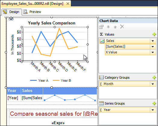
Figure 1: Yearly Sales Comparison Chart
- Review the Chart Data area that appears. You can use this area to modify the fields that are used for each data series. You can also define aggregates and groupings to be used.
- Right-click in different areas of this chart and review the options available.
- To the right of the chart that you just worked on, click twice (do not double click) on the red down arrow next to the title Met Quota? to bring the Gauge report item into focus as shown in Figure 2.
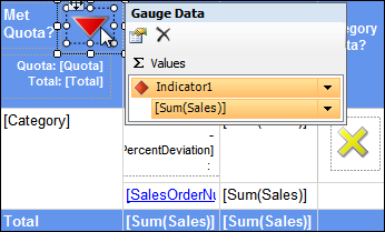
Figure 2: Quota Gauge
- Click the down arrow next to Indicator1 in the Gauge Data area, and then click Change Indicator Type. Review the options available, and then click Cancel.
- Under the chart from step 3, click in the text box associated with Sparkline report item located in the far right column of the Tablix data region that summarizes annual sales as shown in Figure 3.
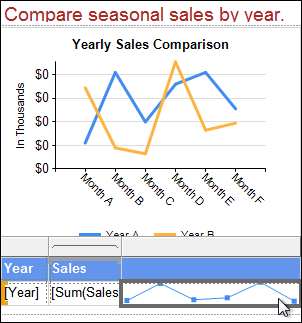
Figure 3: Sparkline
- Right-click the text box containing the sparkline. Notice that both Sparkline and Tablix sections are presented, similar to the Text Box and Tablix sections you worked with in prior chapters. The menu should be similar to the one in Figure 4. If you only have a few options, click closer to the edges of the text box to select the text box rather than the Sparkline report item.
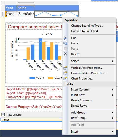
Figure 4: Sparkline and Tablix Menu
- On the menu presented, click Change Sparkline Type
- Review the options in the Select Sparkline Type dialog box, and then select a different type, such as the Stepped Line to the left of the currently selected option, and then click OK.
- The report design is updated to show the new sparkline type, but you won’t know exactly what it looks like until you preview the report with data. Occasionally, these graphical objects look strange while in design mode.
- Change the sparkline back to the Line with Markers type.
- Below the table with the Sparkline report item is a bar graph style Chart report item and a Data Bar report item under the heading Compare seasonal sales… .
- Click on the text box with the Data Bar text box under the [Title] column as shown in Figure 5.
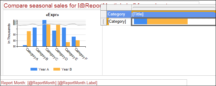
Figure 5: Data Bar
Like the sparkline, the data bar is embedded inside of a Tablix data region. This time the Tablix is configured as a matrix. The data bar will graphically present the data at the intersection of a particular Title and Category.
- Right-click the text box with the Data Bar and review the options available. The menu should look similar to the one in Figure 6.
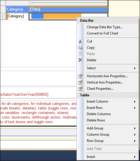
Figure 6: Data Bar Menu
- Press Esc to close the menu.
- Right-click in the center of the data bar and review the menu. It should look similar to Figure 7.
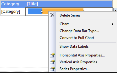
Figure 7: Data Series Menu
- Click Show Data Labels on the menu from step 18. Notice the values added to the bar. Right-click one of the new data labels, and then click Show Data Labels to toggle the data labels back off.
- Preview the report to review the charts and other graphical elements explored in this Try It.
- Close SSDT. Do not save changes if prompted.
Each of the objects that you viewed in the Try It are data bound report items like tables, lists, and matrices. When you add one of these graphical report items to your report, you will be required to bind a dataset to this object.
SSRS 2012 Tutorial: Charts
With charts, you can greatly enhance the visual interest of your reports. Charts help you present report data in a format that is familiar to managers and is frequently easier to interpret. SSRS features a wide variety of chart styles.
Charts in SSRS function in a similar manner to charts in Excel. Since the Report Wizard in SSDT does not support charts, you will need to manually add and configure the charts in your reports. Report Builder, however, has the Chart Wizard template which allows you to quickly create a report with a chart.
| By default, you can open Report Builder by clicking on the Report Builder button in Report Manager. You can access Report Manager by opening Internet Explorer and then typing http://localhost/reports for the URL. Optionally, you can download and install a standard application version that will be accessible from the Start menu. |
Adding a Chart with Report Designer
Like all other report items, charts can be added to a report by dragging the Chart report item  from the Toolbox window to the design surface, by selecting the report item and then drawing the shape on the design surface, or by double clicking the Chart report item in the Toolbox.
Once you add the Chart report item to the Design Surface, the Report Designer opens the Select Chart Type dialog box. The dialog box displays a variety of chart types. Each chart type presents unique options for grouping and presenting data. For example, a pie chart supports groups and nested groups, such as sales by category or by month. Line charts, on the other hand, support an x and y series and are better at displaying trends.
Although the dialog box does not have separate pages for each category of chart types, the links on the left side of the dialog box will jump the cursor to the first chart type of the corresponding category in the type listing. For example, if you click Area on the left side of the dialog box, the first chart in the Area category is selected as shown in Figure 8.
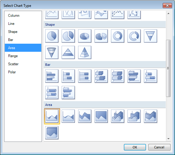
Figure 8: Select Chart Type Dialog Box
| If you are asked to create a chart and the specification requires a specific chart type, a tooltip with the chart type name appears when you pause the mouse over the chart image as shown in Figure 9. |
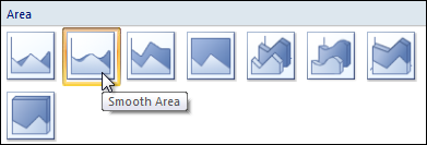
Figure 9: Tooltip Showing Chart type Name
Charts are data regions and are required to be bound to a dataset. If you do not have a dataset defined within your report, Report Designer will present the Dataset Properties dialog box after you click OK in the Chart Type dialog box. If one or more datasets already exist within the report, the chart will be displayed on the design surface when you click OK in the Chart Type dialog box. The first field that you add to the chart will define the dataset that will be bound to the chart.
When you click inside of a chart, the Chart Data window appears. You can add fields to the chart by dragging them from the Report Data window to Chart Data window, or by clicking the plus sign in the appropriate section of the Chart Data window as shown in Figure 10.
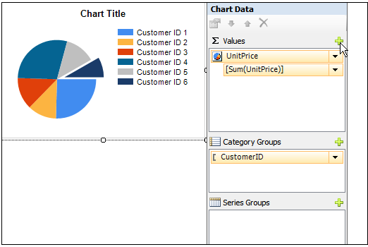
Figure 10: Chart Data Window
Like other report items you have worked with in the course, the Chart Properties dialog box and Properties window associated with the chart allow you to configure settings that affect all areas of the chart, such as the dataset that is bound to the chart, the color palette associated with the chart, the chart’s visibility, and much more. Additionally, there are dialog boxes to control the properties associated with each of the following elements of the chart.
- Chart Legend
- Chart Area
- Title
- Series
- Series Group
- Category Group
| You can choose between custom and built-in palettes for charts. If you will be printing your report in black and white, consider using the Greyscale palette. |
Try It!
By performing the following steps you will create a report that includes a Chart data region. This chart with represent Total Sales by Territory for the current and previous year’s sales based on the information located in the SalesPerson table. Please note that the database is a static entity, so the current year in the database will likely not be the same as the actual current date. A sample of the completed report can be found by opening the EnhancedReports.sln file from the \Samples\EnhancedReports 2 Charts Completed folder.
- Open SSDT and the EnhancedReports.sln file from the \Samples\EnhancedReportsStarter folder.
- In Solution Explorer, right-click the Reports folder, and click Add | New Item.
- In the Add New Item dialog box, select the Report template, type ChartSampleRpt.rdl in the Name field, and then click Add.
- If the Report Designer does not automatically open for your new report, double-click the report in Solution Explorer.
- Add the Chart report item from the Toolbox to the report body. Remember, you can click and drag, select the Chart report item, and then either simply click on the report body area to receive the default size, or use the mouse to drag an outline that defines the size of your new chart.
- When the Select Chart Type dialog box opens, click the 3-D Column type as shown in Figure 11, and then click OK.
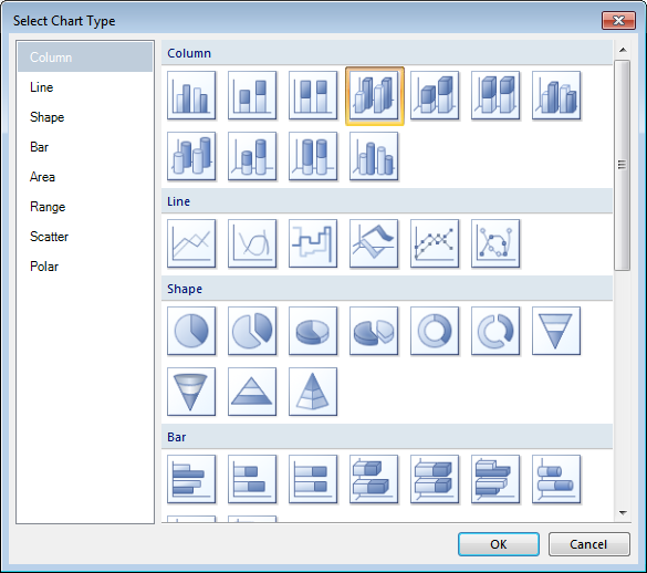
Figure 11: Select Chart Type 3-D Columns
- In the Dataset Properties window, type SalesTerritory in the Name field, select the SalesTerritory shared dataset, and then click OK.
- Click on the words Chart Title to activate the title area of the chart.
- Right-click the chart title area, and then click Title Properties.
- On the General page, remove Chart Title from the Title text box, and then type Annual Sales Comparison by Territory.
- On the General page, review the Title position options by selecting different radio buttons and then clicking OK. When you are finished exploring these options, return to the Chart Title Properties dialog box.
- Click Font in the page selection area on the left side of the Chart Title Properties dialog box.
- On the Font page, select Tahoma, 12pt, and Bold, and then click OK.
- Click somewhere within the picture of the chart to activate the Chart Data window.
- Drag the SalesYTD field from the Report Data Window to the Values area of the Chart Data window.
- Drag SalesLastYear field from the Report Data window to just below the [Sum(SalesYTD)] entry in the Values area of the Chart Data window. Your Values area should look similar to Figure 12.
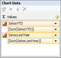
Figure 12: Values Area of the Chart Data Window
- In the Category Groups area of the Chart Data window, right-click the Details group, and then click Category Group Properties.
- In the Category Group Properties window, select [Territory] from the Label drop-down list.
- In the Group expressions area, click Add.
- In the Group on drop-down box, select [Territory].
- On the Sorting page, Click Add.
- Select [Territory] in the Sort by drop-down list, and then click OK. Your Chart Data should look similar to Figure 13.
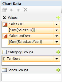
Figure 13: Chart Data Window
- Click the Save All button, and then Preview your report. Your Design and Preview tabs should look similar to Figure 14 and Figure 15, respectively.
Figure 14: Design Tab
Figure 15: Preview Tab
- Experiment with other chart options, types and formatting.
- Close the ChartSampleRpt.rdl Report Designer, but leave the project and SSDT open for a later Try It.
| If you are adding multiple pie charts to your report and using the same categories across the charts, you may want the colors to coordinate. For example, you might want the Bikes category to consistently display as a red bar, Accessories as yellow, and Clothing as green. You can find more information on how to accomplish this in the SQL Server 2012 documentation under “Specify Consistent Colors across Multiple Shape Charts (Report Builder and SSRS)” and also at http://msdn.microsoft.com/en-us/library/dd239350.aspx. |
Using the Chart Wizard in Report Builder
As mentioned earlier, you can use the Chart Wizard template in Report Builder to quickly create a report that includes a chart. Although Report Builder will walk you through the first few steps of creating a chart from within a wizard environment, you will still need to finish configuring the chart on your own.
Try It!
By performing the following steps you will use Report Builder and the Chart Wizard to create a pie chart that shows sales by sales territory. A completed report can be found at \Samples\SampleChartWizardRpt.rdl
- Open Report Manager in Internet Explorer by going to http://localhost/reports.
- Click Report Builder in the Toolbar as shown in Figure 16. Note that it may take a little time for Report Builder to open.
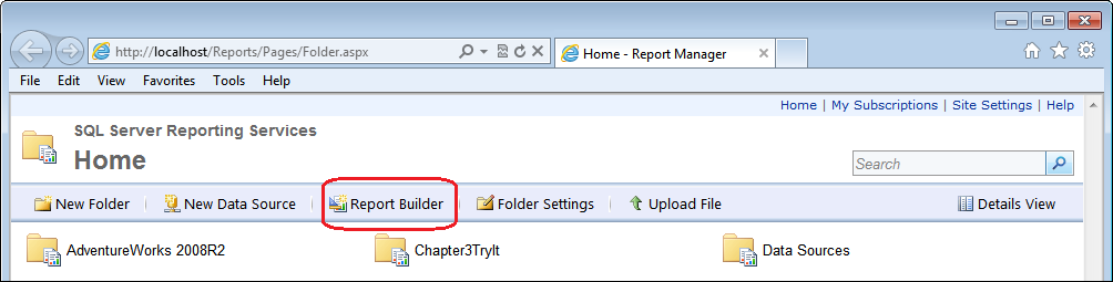
Figure 16: Report Builder Option
- In the Getting Started dialog box, click Chart Wizard.
- On the Choose a dataset page of the New Chart wizard, click Create a dataset, and then click Next.
- On the Choose a connection to a data source page, select the AdventureWorks shared data source, and then click Next. If necessary, click Browse, and then switch to the Data Sources folder, select the AdventureWorks data source, and then click Open.
- On the Design a query page, click the
 Edit as Text button.
- In the text window, type the following code into the command area as shown in Figure 17, and then click Next. Note: This passage of code can be found in \Samples\Queries.txt under Query1. The code can be copied and pasted into the appropriate area.
SELECT Sales.SalesTerritory.Name

,Sales.SalesOrderHeader.SubTotal

FROM Sales.SalesTerritory

INNER JOIN Sales.SalesOrderHeader

ON Sales.SalesTerritory.TerritoryID =

Sales.SalesOrderHeader.TerritoryID
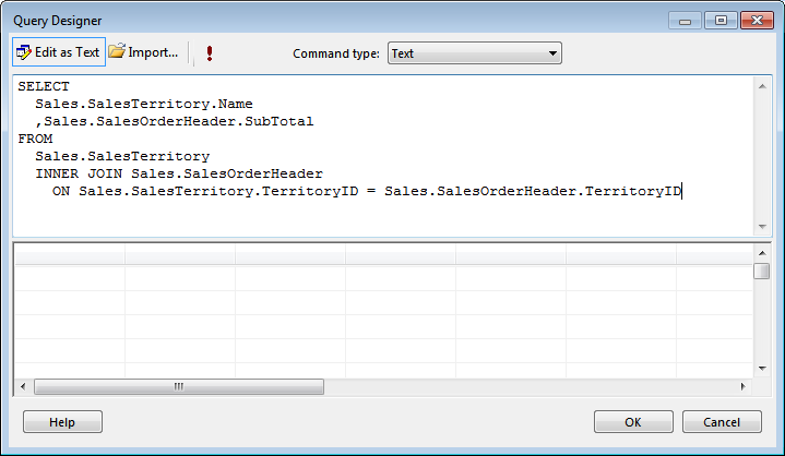
Figure 17: Command Area of the Query Designer
- On the Choose a chart type page, click Pie, and then click Next.
- On the Arrange chart fields page, drag SubTotal from the Available Fields box to the Values box. Drag Name to the Categories box, and then click Next.
- On the Choose a style page, select a style from the available list, and then click Finish.
Note: The completed sample file is based off of the default Ocean style.
- The new report and chart are automatically opened and displayed in Report Builder. Your report should look similar to the one in Figure 18.
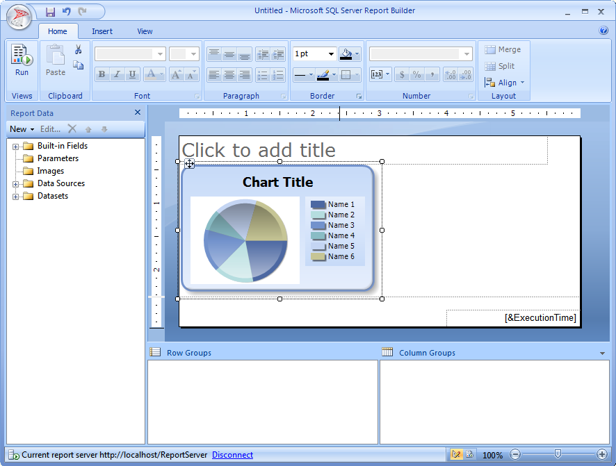
Figure 18: Report Builder Results
- Click in the area labeled Click to add title and type Sales by Territory.
- Change the chart title to Sales in Thousands.
- Right-click in the center of the pie chart, and then click Show Data Labels.
- Right-click on any of the Data Labels that were added in the previous step, and then click Series Label Properties.
- On the Number page of the Series Label Properties, make the following changes:
- Click Currency in the Category box
- Change the Decimal places to 0
- Select the Use 1000 separator (,) option
- Select the Show values in option, and verify that Thousands is selected in the drop-down box.
- Click OK.
- Click on a blank area of the report.
- Pause the mouse over the dotted line separating the graph from the page footer, until the double arrow appears as shown in Figure 19.
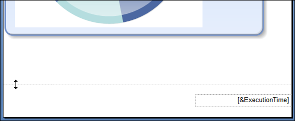
Figure 19: Resizing Arrows
- Click and drag the line down to approximately the six inch mark on the ruler.
- Click anywhere in the chart report item to activate it.
- Use the resizing handles to adjust the graph to fill the report horizontally, while trying to maintain a pleasing aspect ratio.
- Click the Save button
 , or click the Report Builder button
  and then click Save. The Save As Report dialog box will open.
- Verify that the Look in box is set to http://localhost/ReportServer or the proper URL to your report server, type SampleChartWizardRpt.rdl in the Name field, and then click Save.
- Click Run in the Views section of the Home ribbon to preview your report.
- Your report should look similar to the one in Figure 20.
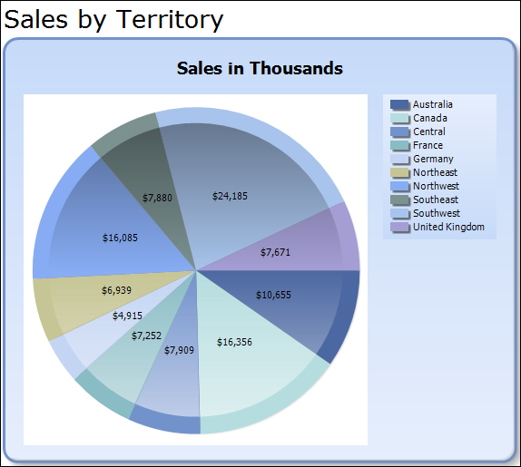
Figure 20: Finished Report
- Close Report Builder.
SSRS 2012 Tutorial: Gauges
With gauges, you can start creating reports that resemble the scorecards and dashboards that have become popular in the business intelligence (BI) community. Like charts, gauges give a pictorial representation of summary data rather than columns and rows of numbers. While charts typically are used to compare a series of aggregated values, gauges typically present the state of a single series. For example, a bar chart will compare the values for actual sales vs. goals across several years. On the other hand, a gauge will show the state of the data along a continuum, like a fuel gauge.
You can use a gauge to display Key Performance Indicators (KPIs), values from a matrix, or even add multiple gauges in a single gauge panel to compare values presented in different gauges.
Try It!
By performing the following tasks, you will add a gauge to an existing table that will provide a visual to compare a salesperson’s year-to-date sales with their individual sales quota. A sample of the completed report can be found by opening the EnhancedReports.sln file from the \Samples\nhancedReports 4 Guages Completed folder.
- Open SQL Server Management Studio (SSMS) from the SQL Server 2012 folder on the Start Menu.
- In the Connect to Server dialog box, verify that your Server name is selected and that Windows Authentication is selected, and then click Connect.
| If you are not running SQL Server locally on your student machine, or if the account you are logged in with does not have dbo privileges in the AdventureWorks2008 database, enter the appropriate information for your environment before clicking Connect. |
- In SSMS, click File | Open | File.
- In the Open File dialog box, browse to \Samples, click UpdateSalesQuotas.sql, and then click Open.
- Press F5 to execute the query. Verify that the Messages tab says "(17 row(s) affected)".
The YTD Sales for each sales person exceeds their quotas by over 10 times in many cases. The query updates the quotas to make them more reasonable. |
- Close SSMS.
- Verify that the EnhancedReports.sln file is open in SSDT.
- In Solution Explorer, double click SampleGaugeRpt.rdl to open Report Designer for the report.
- Drag a gauge item from the Toolbox to the cell in the second row of the empty column on the right side of the report.
- On the Select Gauge Type dialog box, click Bullet Graph as shown in Figure 21, and then click OK.
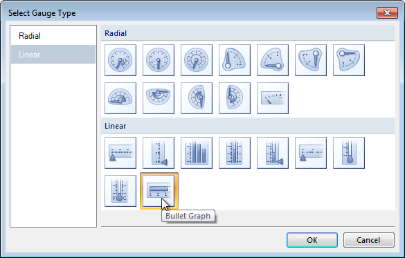
Figure 21: Selecting the Bullet Graph Gauge Type
- Select the Gauge in the table (not the text box holding the gauge). This will make the Gauge Data window visible to configure.
- Click the down arrow next to the LinearPointer1 row, and then click Pointer Properties.
- In the Linear Pointer Properties dialog box, click the expression button next to the Value drop-down list.
- In the Expression dialog box, type the following code, and then click OK twice:
=((Fields!SalesYTD.Value)/Fields!SalesQuota.Value)*100
- In the Gauge Data window, click the down arrow next to the LinearPointer2 row, and then click Delete Pointer as shown in Figure 22.
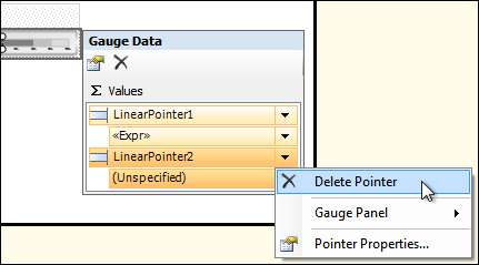
Figure 22: Delete Pointer Option
- Save your project, and then preview your report. Your report should look similar to Figure 23.
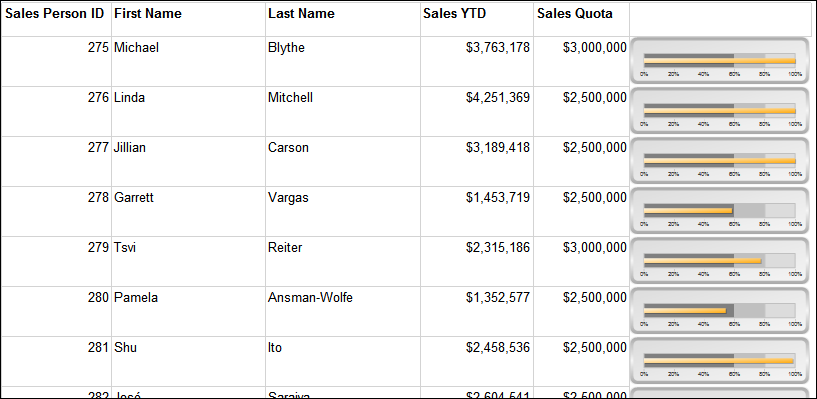
Figure 23: Final Gauge Report
| There are several sales people who do not have a sales quota. For this report, they were removed by testing for a NULL value in SalesQuota field in the query pulling the data in the shared data set. If this was not the case, you would have to use a combination of the IsNothing and IIF functions to handle these rows. Otherwise, you will get a divide by zero error. Since this report is comparing their year to date sales to their quotas, it makes sense to exclude people without a sales quota. |
SSRS 2012 Tutorial: Add a Map to a Report
The mapping feature was added in SQL Server 2008R2 and allows you to add maps to your reports based on locality information stored within your databases. You can use a bubble map to shows areas on a map where you have clusters of clients, or you can use a line map to show routes from a convention center to local hotels or points of interest. To make the reports more interesting, you can add a Bing map layer that will allow you to choose between aerial, road, or a combined background display for your map.
The mapping feature uses the concept of layers to allow you to add data points representing customer locations and a polygon outlining sales territories all with a background of an aerial Bing map.
Although you can use both Report Designer and Report Builder to add maps to your reports, Report Builder offers a wizard. If you haven’t worked with reports before, the map wizard in Report Builder may not be intuitive enough to just jump in to creating your first map.
When you add a Map report item, you must define the source of the spatial data to be used. You will also be able to define the source when you add a new layer to your map. The Choose a source of spatial data page of the New Map Layer wizard displays the following options:
- Map Gallery: A set of default reports into which your spatial data is embedded. For a default instance of Reporting Services, the map gallery is located at \Program Files\Microsoft SQL Server\MSRS11.MSSQLServer\Reporting Services\ReportServer\ReportBuilder\RptBuilder_3\MapGallery.
- ESRI shapefile: A set of files that contain geometrical shape data such as points, polylines, and polygons in a shp file as well as properties or attributes that describe the shapes in a dbf file. These are often used in geographic information systems to represent particular regions, areas, or geographic features.
- SQL Server spatial query: Uses a query built to retrieve data from columns in your database with a geography or a geometry data type.
| You can get more information about working with spatial data types in a white paper named New Spatial Features in SQL Server Code-Named “Denali”. When this book was published, this white paper could be found at http://go.microsoft.com/fwlink/?LinkId=226407 . Please note that Microsoft links and papers frequently move and change, but you can usually find it by searching on all or part of the title. |
The areas of a map item are shown in Figure 24. Like the other visual report items, each of these areas has a set of properties that you will use to configure the map.
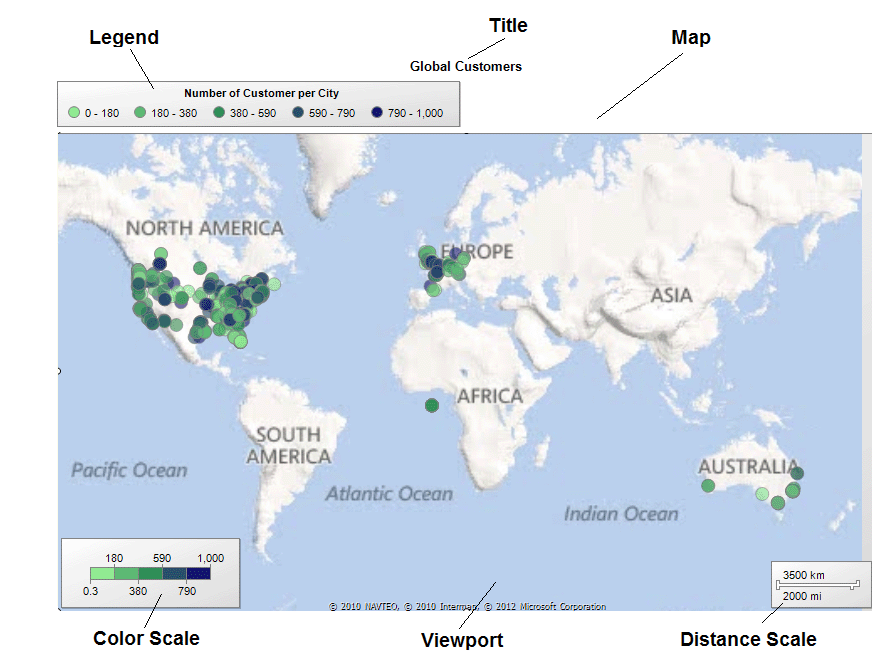
Figure 24: Map Areas
Try It!
By performing the following steps, you will create a report that contains a map showing cities in Ohio with customers of the AdventureWorks company. A sample of the completed report can be found by opening the EnhancedReports.sln file from the \Samples\EnhancedReports 5 Map Completed folder.
- Verify that SSDT and the EnhancedReports.sln file from the \Samples\EnhancedReportsStarter folder are open.
- In Solution Explorer, right-click the Reports folder, and click Add | New Item.
- In the Add New Item dialog box, select the Report template, type OhioCustomerMap.rdl in the Name field, and then click Add.
- If the Report Designer does not automatically open for your new report, double-click the report in Solution Explorer.
- In your new report’s Report Data window, add a pointer to the OhioCustomers shared dataset.
- Add the Map report item from the Toolbox to the report body.
- The New Map Layer wizard automatically opens. On the Choose a source of spatial data page select SQL Server spatial query as shown in Figure 25, and then click Next.
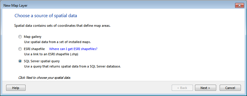
Figure 25: Choosing a Source for Spatial Data
- On the Choose a dataset with SQL Server spatial data page, select OhioCustomers, and then click Next.
- On the Choose spatial data and map view options page, notice that SSRS automatically recognized the geography data type and places the SpatialLocation column in the Spatial field drop-down box.
- Select Point for the Layer type, select the Add a Bing Maps layer option, set the Tile type drop down list to Aerial, as shown in Figure 26, and then click Next.
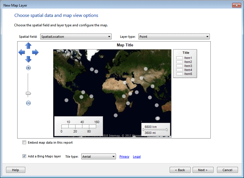
Figure 26: Adding a Bing Maps Layer
- On the Choose map visualization page, select Basic Marker Map, and then click Next. If our dataset also included sales information and we wanted to represent sales by city or region, we would choose a bubble map rather than the basic marker type.
- On the Choose color theme and data visualization page, select PushPin from the Marker drop-down list, and then click Finish.
- If necessary, move the map to the upper left corner of the report body, and then resize the report to be approximately 10.5 inches wide x 6.5 inches tall.
| Remember, you can enable the rulers by clicking Report | View | Ruler, or you can use the Properties window for the Map object to set the Size property in the Position section. |
- Right-click any pushpin, and then click Point Properties.
- In the Map Point Properties dialog box, select City in the Tooltip drop-down list, and then click OK. This will allow report users to see the city name when they pause their mouse button over a pushpin.
- Change the map title to Ohio Customers.
- Add a text box to the bottom of the map, and type the following:
Click on any pushpin to see detailed information for that customer.
| The actual implementation of the feature to go along with this textbox will be implemented in the drillthrough report Try It later in the course. |
- Preview the report.
- Return to Design mode.
- In the Map Layers window, click the down arrow next to TileLayer1 Bing Maps as shown in Figure 27, and then click Tile Properties.
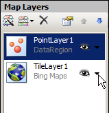
Figure 27: Map Layers
- In the Tile options section, select Hybrid from the Type drop-down list, and then click OK.
- In the Map Layers window, click the Down arrow next to PointLayer1, and then click Point Properties.
- Use the Fill page of the Point Properties window to change the pushpin color to Brown.
- Save all files and preview the report.
- If time permits, continue to explore the map options available in your report.
- Close the report, but leave the EnhancedReports project and SSDT open for the next Try It.
SSRS 2012 Tutorial: Data Bar, Indicator, and Sparkline Report Items
In SQL Server 2008R2, Microsoft added three additional features that will allow you to create the dashboard type reports that many analysts are looking for. Each of these report items typically work best when used embedded within a Tablix report item so that the graphic is displayed for each row that is returned from the data set.
Data Bars
A data bar is a very basic chart. Like a gauge, a data bar typically graphically displays a single value for the corresponding row of data being returned from the data set. A data bar in the report header may not be that beneficial, but when added to a table or matrix, the report consumer can easily identify trends and problem rows. Data bars can display more than one value, but this usage is not common. You can use a data bar to show the relative value of each sales person’s year-to-date sales.
Once you have created a data bar, if you decide that a more complex chart would work better, you can right-click the data bar and select Convert to Full Chart. This process is not as easily reversed because all non-compatible features must be removed from the chart before conversion.
Indicators
Indicators are small single icons that can be used to either quickly show the state of a given value, or a trend between values. You can use the Indicator report item to show a red, yellow, or green flag for the current row based on one of your business’s key performance indicators, such as annual growth. When you define an indicator, you must define what determines the color or shape of the indicator. For example, coming within 90% of the goal would produce a green flag, within 75% a yellow flag, and less than 75% a red flag. If you do not define the range of values to be used for each indicator, the range of values will be split equally over the number of indicators that exist in the indicator type that you choose.
Sparklines
Like the other report items in this section, sparklines are frequently embedded within a Tablix data region to display information about the corresponding row from the data set. Unlike data bars and indicators, sparklines are generally used to display a series of values, rather than a single value. For instance, you can use a data bar to show a sales person’s year-to-date sales in comparison to all sales for the year, while using a sparkline to show their monthly totals so that you can compare the trends month to month for each salesperson.
You will typically define a sparkline for a row within a grouping. For example, you may add a sparkline representing total sales within the year grouping, and define the point values along the x axis of the sparkline to represent a more detailed level, such as months.
Like charts, when you add a sparkline report item to your report, you will manage the data being presented through the Chart Data window. From our example above with the sparkline representing monthly sales within a particular year, when you add the sales amount value as the first series, the default behavior is to sum the field selected if it is a numeric field, or provide a count of non-numeric fields. When you select the down arrow next to the Sum value that is added, you are presented with the options to change the field being used and the aggregate being used as shown in F. Like most fields in SSRS, you can also define a custom expression to provide the Y values for the sparkline.
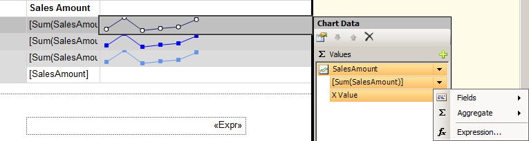
Figure 28: Changing the Sparkline Field Data
Try It!
By performing the following tasks, you will create a report that includes a data bar and an indicator. Each of these report items will display a different value with regard to a sales person’s year-to-date sales and sales quotas. The dataset only includes sales people with quotas. Also note that the query is only returning the monthly sales amounts for the year 2008, which in the database is the current year. In real life, a variable would be used for the year, but for simplicity in the practice, a fixed year was used since the data never changes. If you did not complete the previous Try It, you can use the EnhancedReports.sln file located in either the EnhancedReportsStarter or EnhancedReports 5 Map Completed folder. A sample of the completed report can be found by opening the EnhancedReports.sln file from the \Samples\EnhancedReports 6 Visualization Completed folder.
- Verify that the EnhancedReports solution file is open in SSDT.
- Open the report named SampleDataVisualizationRpt.rdl.
- Drag the Data Bar report item from the Toolbox to the text box in the second row of the column titled YTD Sales as shown in Figure 29.
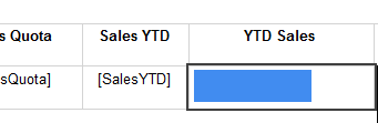
Figure 29: Data Bar Drop Location
- In the Select Data Bar Type dialog box, verify that the default Bar type is selected in the Data Bar section as shown in Figure 30, and then click OK.
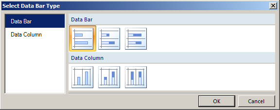
Figure 30: Select Data Bar Type Dialog Box
- Click in the center of the data bar that appears. The Chart Data window should appear.
- In the Chart Data window, click the plus sign in the ? Values area as shown in Figure 31, and then click SalesYTD.
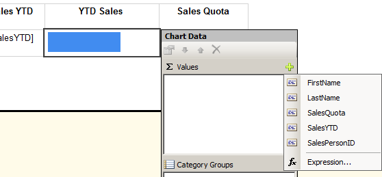
Figure 31: Chart Data Window
- Drag the Indicator report item from the Toolbox to the text box in the second row of the column titled Sales Quota.
- In the Select Indicator Type dialog box, in the Symbols area, click to select the 3 Flags type as shown in Figure 32, and then click OK.
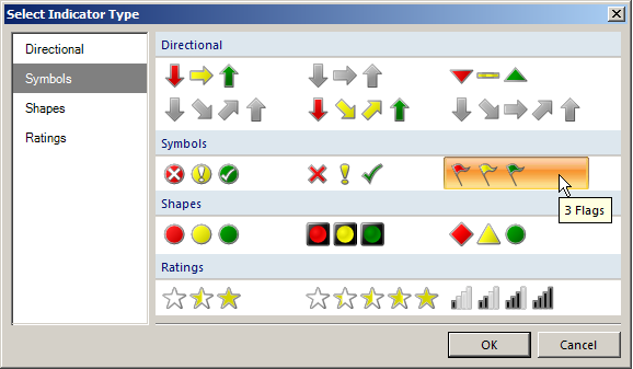
Figure 32: Select Indicator Type Dialog Box
- Click the flag that appears. The Gauge Data window should appear with a row for Indicator1.
- In the Gauge Data window, click the down arrow next to Indicator1 as shown in Figure 33, and then click Indicator Properties.
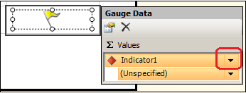
Figure 33: Gauge Data Window
- On the Values and States page, change the States Measurement Unit to Numeric, change the following values in the Indicator states area:
- Red: Start 0 – End .5
- Yellow: Start .5 – End .99
- Green: Start .99 – End 100
The finished page should look similar to Figure 34. The value of 100 in the end allows for salespeople who drastically exceed their quotas.
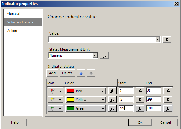
Figure 34: Indicator Properties Dialog Box
- Click OK in the Indicator properties dialog box.
- In the Gauge Data window, click the down arrow next to (Unspecified) as shown in Figure 35, and then click Expression.
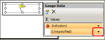
Figure 35: Gauge Data Window
- In the Expression windows, either click on the appropriate fields and arithmetic operator, or type the following expression, and then click OK.
Fields!SalesYTD.value / Fields!SalesQuota.value
- Save and Preview your report.
- Close the SampleDataVisualizationRpt.rdl report, but leave EnhancedReports project and SSDT open for the next Try It.
SSRS 2012 Tutorial: Nesting Data Regions
You can nest one data region inside of another data region. You saw this feature in several of the Try Its in this chapter. When nesting a report item, it is important to remember the scope of each area on the report surface and understand how that will relate to your new report item. For example, if you add a chart to the text box located in the Tablix Corner (the upper left corner of a matrix), it will present static data that will appear only once, at the beginning of the report. If you add a Sparkline report item to a text box in the Details area of the report, you will receive one Sparkline for every row of data being returned from the dataset query.
In addition to adding graphical report items to a Tablix data region, you can also nest other report items. For example, you can nest a Table report item inside of a List report item to provide details under a group heading with page breaks between each grouping.
With SQL Server 2008R2, Microsoft added a feature called Report Parts. With Report Parts, you can save and deploy charts, maps, or any object in a report individually. You can then re-use or build from those report parts in new reports. Report Parts will be covered in more detail in Chapter 10, Working with Report Builder. Because nested data regions do not exist exclusive of the data region of which they are a part, you cannot save them as report parts.
Try It!
By performing the following steps, you will nest a table inside of a list item. This will allow you to work with a report similar to ones that the Report Wizard creates when you select the options to group objects at the page level. A sample of the completed report can be found by opening the EnhancedReports.sln file from the \Samples\EnhancedReports 7 Nesting Completed folder.
- Verify that the EnhancedReports solution file is open in SSDT.
- Create a report named SampleNestedRpt.rdl.
- Add a pointer to the SalesOrderDetails shared dataset in the Report Data window for your new report.
- Add a List report item to the design surface. Keep in mind that like tables and matrices, list report items are implemented as a Tablix data region.
- Click inside the Tablix data region and then click the Tablix corner to allow you to move and resize the Tablix data region.
- Resize the data region to fill the existing report body area as shown in Figure 36.
Figure 36: Resizing the Data Region
- Click within the List data region to activate the Tablix data region.
- Right-click any of the handles around the data region, and click Tablix Properties.
- In the Tablix Properties dialog box, select the SalesOrderDetails data set in the Dataset name drop-down list, and then click OK.
- In the Row Groups area, click the down arrow next to the (Details) group as shown in Figure 37, and then click on Group Properties.
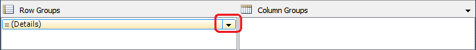
Figure 37: Details Group Down Arrow
- In the Group Properties dialog box, on the General page, change the Name to SalesOrders, and then click Add in the Group expressions area.
- On the Group on drop-down list, select [SalesOrderNumber].
| By adding a group expression, you changed your details grouping to be a parent group organized by sales order ids. |
- Click Page Breaks to switch to the Page Breaks page.
- On the Change page break options page, select the box next to Between each instance of a group as shown in Figure 38.
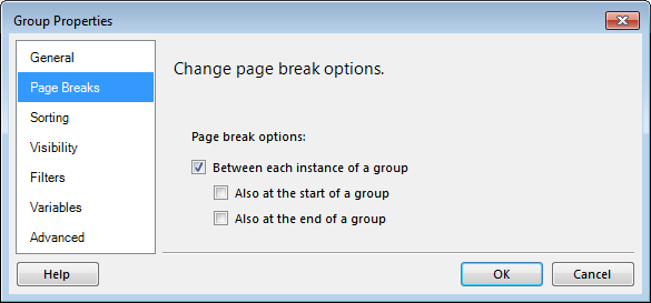
Figure 38: Group Properties
- Click OK to close the Group Properties dialog box. Notice that the three horizontal lines representing detail rows
 are now gone in both the Row Groups area and the List data region, and have been replaced by the group symbol
  .
.
- Add the following data fields near the top of the list data region:
- SalesorderNumber
- CustomerID
- OrderDate
- Arrange the fields similar to Figure 39.
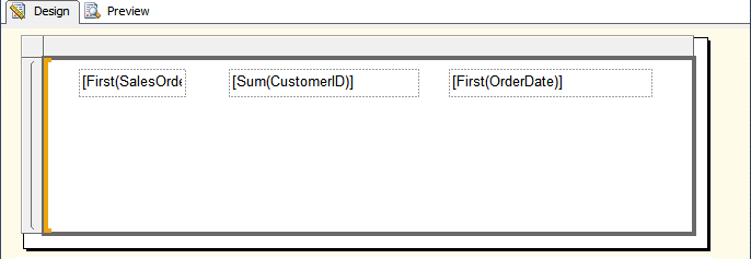
Figure 39: Arranging the Fields
- For each field, right-click the text box and click Expression. In the expression dialog box, type the following for each respective box.
="Sales Order: " & Fields!SalesOrderNumber.Value="Customer: " & Fields!CustomerID.Value="Order Date: " & Fields!OrderDate.Value
Note: You can copy these expressions from the Embedded Objects Expressions.txt file located in the \Samples folder.
- Drag a Table report item from the toolbox to just below the fields that you edited.
- Add the following fields to the table from left to right as shown in Figure 40.
- ProductID
- OrderQty
- LineTotal
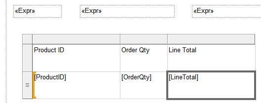
Figure 40: Adding Fields
- Preview the report. View several pages and notice that each new Sales Order starts on its own page.
- Practice formatting your report, or nest a chart in the List data region.
SSRS 2012 Tutorial: Subreports and Drillthrough Reports
Reporting Services offers a wide variety of options for organizing data within a report. In this and previous chapters, you have already worked with hiding groups to provide reports that users can drill down into. Additionally, you have nested data regions inside of each other to correlate different types of data regions such as tables and data bars. In addition to these features, SSRS provides you with the ability to define subreports that can be used in multiple locations and inserted into parent reports. Drillthrough reports are launched when a user clicks on a link in a report. You will use parameters to pass information from the parent to the child report
| SSRS also includes a feature called Linked Reports. Linked Reports are created and managed in Report Manager. Linked reports have their own settings such as permissions and parameters, but link to a shared report definition. |
Working with Subreports
Subreports offer many advantages when designing reports. First, they allow you to reuse portions of a report in more than one parent report. Additionally, because they can use the same or different data sets from the parent report, they add flexibility for complex reports.
Because subreports are generated at the same time as the parent report, they do not offer any performance benefits. Additionally, they may even slow performance over nested or separate data regions because SSRS processes each instance of the subreport as a separate report, even though it is displayed within the parent report.
A subreport can be added to an empty location on the parent report’s report body, or it can be added to a data region. If you add a subreport to a data region, it will repeat for each group or detail row in which it was embedded.
| If your subreport is located within a cell of a table or matrix, the page breaks defined within the subreport will be ignored. |
Passing Parameters
You can pass information from the parent report to the subreport by using parameters. You must first create a report parameter in the subreport. When you add the subreport to the parent report, you can define the name of the report parameter and the value that you want to pass to it on the Parameters page of the Subreport Properties dialog box. For subreports nested in a data region, you will use a field expression to define the value to be passed for each row or group. If you are using Report Designer in SSDT, and the subreport and parent report are in the same project, you will be able to select the parameter from a list as shown in Figure 41. Otherwise, if the subreport is located on the report server, you need to be sure to type the name exactly as it is defined in the subreport.
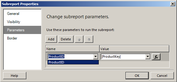
Figure 41: Subreport Properties
| You must include a report parameter and not a query parameter in the subreport. |
Try It!
By performing the following steps, you will insert a subreport that stands on its own, without the need to pass parameters. The subreport will appear on the first page of the parent report. A sample of the completed report can be found by opening the EnhancedReports.sln file from the \Samples\EnhancedReports 8 Subreport Completed folder.
- If necessary open SSDT and the EnhancedReports.sln file.
- Open, review the design of, and preview SubreportChildRpt.rdl.
- Close any open reports.
- Open, review, and preview SubreportParentRpt.rdl.
- Return to the Design tab.
- Drag the Subreport report item from the Toolbox and place it to the right of the existing report as shown in Figure 42. If necessary, resize the subreport similar to the figure.
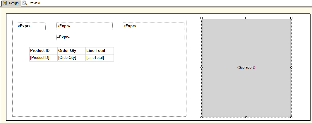
Figure 42: Subreport Item
- Right-click the subreport that you just added, and then click Subreport Properties.
- In the Subreport Properties dialog box, on the General page, select SubreportChildRpt from the Use this report as a subreport drop down list, and then click OK.
| If the subreport is published to a report server running in Native Mode, remove any information from the drop-down list, and then type the full or relative path to the subreport. If the reports are deployed to a SharePoint Integrated SSRS server, the parent and subreports must exist in the same folder, and the filename of the report including the file extension should be used. |
- Preview the report. Close the SubreportParentRpt.rdl design tab, but leave the EnhancedReports project and solution open in SSDT.
SSRS 2012 Tutorial: Working with Drillthrough Reports
In addition to making it easier to design reports with complex requirements, drillthrough reports have the added benefit of improving performance. Drillthrough reports are not generated until the action linked to the drillthrough report is activated. Because the drillthrough report is an independent report on its own, it can be launched directly from Report Manager in addition to being launched from the parent report.
The top or general level of information can be displayed on the first report. You will then use the Go to report option on the Action page of the appropriate object to configure the report to be launched when a user clicks on that object.
When you configure an action for an object, it does not automatically format the object to alert the user that if they click on the object, it will do something different. For text boxes, you will frequently format the text to be blue and underlined, the universal sign for a hyperlink. SSRS also gives you the ability to design a tool tip that will be displayed when you pause the mouse over the object. In some cases, you may want to add additional text to explain what will happen if they click the object.
There are many situations where the use of a drillthrough report would be valuable including the following:
- Opening a detailed report with information on the individual sales information for a particular product category in a pie chart showing total sales by category.
- Opening an individual sales order report from a list of all orders placed in the last 5 years.
- Opening a report listing a specific employee’s hire date, personal information, and department history from a report showing all employees.
Like subreports, you will use parameters to pass values from the parent report to the drillthrough report.
Try It!
By performing the following steps, you will add a drillthrough report to the OhioCustomerMapRpt report that will provide detailed information about a particular customer. A sample of the completed report can be found by opening the EnhancedReports.sln file from the \Samples\EnhancedReports 9 Drillthrough Completed folder.
- If necessary open SSDT and the EnhancedReports.sln file. If you have not completed the previous Try It exercises, you can use the solution file located at \Samples\EnhancedReports 8 Subreport Completed.
- Open, review, and preview the OhioCustomerDetailRpt.rdl report. Leave the OhioCustomerDetailRpt.rdl design tab open.
- Open, review, and preview the OhioCustomerMapRpt.rdl report. . Leave the OhioCustomerMapRpt.rdl design tab open.
- If necessary, change to the OhioCustomerDetailRpt.rdl design tab.
- In the Report Data window, right-click the Parameters folder, and then click Add Parameter.
- In the Report Parameter Properties dialog box, type AddressID for both the Name and Prompt fields.
- Set the Data type to Integer.
- Set the Select Parameter visibility to Hidden, and then click OK.
- In the Report Data window, right-click the OhioCustomerDetails dataset pointer, and then click Properties.
- Change to the Filters page.
- Click Add in the Change filters area. Select [AddressID] from the Expression drop-down list, select = from the Operator drop-down list, and then click the expression button
 .
.
- In the Expression dialog box, click Parameters in the Category area, double-click AddressID in the Values area, and then click OK. Click OK to close the dataset Properties window.
- Change to the OhioCustomerMapRpt.rdl design tab.
- If necessary, click inside the map to activate the Map Layers window.
- In the Map Layers window, click the down arrow next to PointLayer1, and then click Point Properties.
- In the Map Point Properties window, go to the Action page, and then select Go to report in the Enable as an action section.
- Select OhioCustomerDetail in the Specify a report drop-down list.
- Click Add in the Use these parameters to run the report section.
- In the same column, select AddressID. In the value column, select [AddressID] if available. If it is not available, click the expression button next to value, double-click AddressID in the Fields (OhioCustomers) category, and then click OK to close the Expresson dialog box.
- Click OK to close the Map Point Properties dialog box.
- Preview the OhioCustomerMapRpt. Click on a pushpin and verify that the OhioCustomerDetail report opens and only includes information that correlates to the pushpin you selected.
SSRS 2012 Tutorial: Exercises
Required files can be found under the \Labs folder.
Exercise 1: Creating a complete solution
The goal of this exercise is to review many of the concepts learned in the course up to this point. This is the final chapter covering Report Designer in detail and this exercise will allow you to practice and build these concepts together, from the creation of the project through the creation of the basic reports that will be used in the following exercises. A sample solution can be found in the Exercise1Solution\EnhancementsLab folder. Answers may vary depending on how the directions are interpreted.
- Open SSDT.
- Create a new Report Server Project named EnhancementsLab in a solution with the same name. Save the project and solution under your project directory or in \Labs
- Add a shared data source pointing to the AdventureWorks2012 database on your SQL Server and name it AdventureWorks.
- Create a second shared data source pointing to AdventureWorksDW2012 named AdventureWorksDW
- Create a shared dataset named VendorInfo based on the following query pointing to the AdventureWorks data source:
SELECT Purchasing.ProductVendor.ProductID

, Purchasing.Vendor.Name AS VendorName, Purchasing.Vendor.AccountNumber,

Purchasing.Vendor.PreferredVendorStatus

FROM Purchasing.Vendor INNER JOIN

Purchasing.ProductVendor ON Purchasing.Vendor.BusinessEntityID = Purchasing.ProductVendor.BusinessEntityID

WHERE (Purchasing.Vendor.ActiveFlag = 1)
- Create a shared dataset name ProductSalesInfo based on the following query pointing to the AdventureWorksDW data source:
SELECT DimProductCategory.EnglishProductCategoryName

AS Category

, DimProductSubcategory.EnglishProductSubcategoryName

AS Subcategory

,DimProduct.EnglishProductName AS Product

, FactInternetSales.OrderDateKey

, DimDate.CalendarYear

, DimDate.MonthNumberOfYear AS Month

, FactInternetSales.SalesAmount

, FactInternetSales.ProductKey

FROM FactInternetSales INNER JOIN DimDate

ON FactInternetSales.OrderDateKey = DimDate.DateKey INNER JOIN DimProduct

ON FactInternetSales.ProductKey = DimProduct.ProductKey INNER JOIN DimProductSubcategory

ON DimProduct.ProductSubcategoryKey =

DimProductSubcategory.ProductSubcategoryKey

INNER JOIN DimProductCategory

ON DimProductSubcategory.ProductCategoryKey =

DimProductCategory.ProductCategoryKey
- Create a new blank report named ProductSalesRpt.
- Add a dataset pointer named ProductSalesInfo to this report that points to the ProductSalesInfo shared dataset.
- Add a table to this report.
- Add a text box above the table and add the title Product Sales by Year and Category. Center the title and configure the font as 24pt.
- Add a page footer that includes the date and time the report was run as well as the current page number.
- Add SalesAmount to the first column of the table and hide the (Details) row group.
- Add groups so that sales amount is aggregated first to the product level, then the category, then the year. Add a Group Header to each new group and configure the group visibility to be hidden and toggled based on its parent, except for the (Details) group.
- Format the values in the Sales Amount column as currency with two decimal place and commas as the thousands separator.
- Add an expression to calculate the total sales amount for each grouping.
- Your report design should look similar to Figure 43.
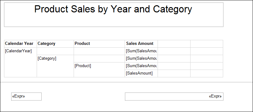
Figure 43: ProductSalesRpt Design
- Create a new blank report named VendorSubReport.
- Add a dataset pointer to this report that points to the VendorInfo shared dataset.
- Add a table to this report.
- Add the following fields to the table from left to right:
- VendorName
- AccountNumber
- PreferredVendorStatus
- Add the Bold fontweight property to the textboxes located in the first row.
- Add a background color of Silver to the first row and LightSteelBlue to the Details rows.
- Preview the report and adjust column widths as necessary. Don’t worry about duplicate rows. That will be handled in a later exercise.
- Move the table to the upper left corner of the report body, and then adjust the report body to be the same size as your table.
- Your report Design and Preview tabs should be similar to those in Figure 44 and Figure 45.

Figure 44: VendorSubReport Design
| Depending on the width of your final column, and also the auto-grow properties, the last column may or may not show the full title of the Preferred Vendor Status column. In Figure 44 above, the column is set to auto-grow in height if the field does not fit. This is why you see the remainder of the name when you preview the report, but not before. |

Figure 45: VendorSubReport Preview
Exercise 2: Adding data visualization report items to a report
The goal of this exercise is to allow you to practice the steps involved with adding data visualization report items to an existing report. Step by Step directions are provided in the Solutions to Exercises section. Answers may vary depending on how the directions are interpreted. If time permits, feel free to explore additional report items and options. A sample solution can be found in the Exercise2Solution folder.
- If necessary open your EnhancementsLab.sln solution file from Exercise 1 or from the \Labs\Exercise1Solution\EnhancementsLab folder.
- Open and review the ProductSalesRpt.rdl report from Exercise 1.
- Add a sparkline to the last column of the row associated with the CalendarYear group total.
- Use the Line with Marker Sparkline type as shown in Figure 46.
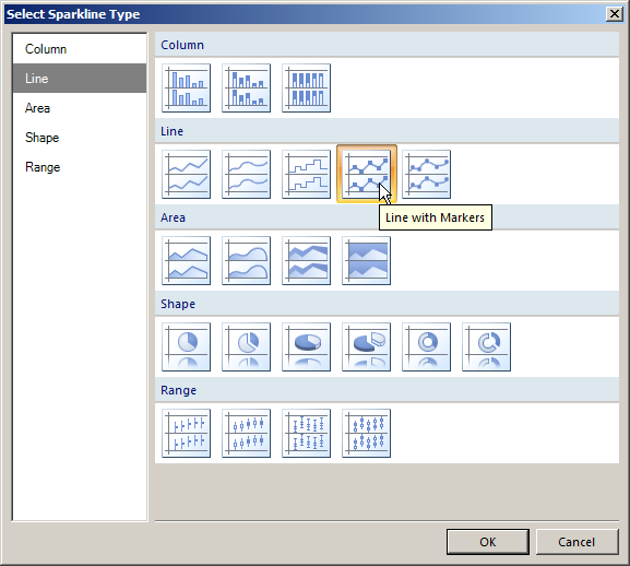
Figure 46: Line with Markers Sparkline
- Configure the sparkline to include a category group based on the Month rather than the (Details) group.
Note: This field uses the numeric value for each month of the year. If you are using a month name, you would need to be sure that your data was sorted based on a calendar and not alphabetically.
- Use a Sum of the SalesAmount field as the Values for the sparkline.
- Configure the series to include a tooltip that shows the sales amount total, formatted as Currency with no decimal places.
- Configure the Horizontal Axis to be a Scalar axis type and to have a Minimum value of 1 and a maximum value of 12.
- Copy the Sparkline item to the text boxes associated with the total rows for the Category and Product groups as well.
- Change the background colors of each grouping to something unique to help users differentiate the groups.
- Modify the marker and line colors of at least one of the Sparklines to help differentiate between them.
Hint: The Color property in the Appearance section of the Chart Series Properties window, or on the Fill page of the Series Properties dialog box control the color of the lines connecting the markers.
- Preview the report.
- Save all files and leave the report, project, and SSDT open for the next exercise.
Exercise 3: Adding a correlated sub-report
The goal of this exercise is to allow you to practice the steps involved with adding a subreport to a parent report. You will also practice sending a parameter through to the subreport. Step by Step directions are provided in the Solutions to Exercises section. Answers may vary depending on how the directions are interpreted. A sample solution can be found in the Exercise3Solution folder.
- In SSDT, verify that the EnhancementsLab project and solution from the previous exercise are open. If necessary open your EnhancementsLab.sln solution file from Exercise 2 or from the \Labs\Exercise2Solution \EnhancementsLab folder.
- Verify that the ProductSalesRpt.rdl and VendorSubReport.rdl reports are open in SSDT.
- If you did not complete the prior exercises, review and preview both reports.
- In the table for the ProductSalesRpt, add a row inside of the Product group below the existing rows.
- Merge the two cells on the right-most side of the new row together.
- Add the VendorSubReport.rdl report as a subreport to this newly merged textbox.
- Change to the Report Designer for the VendorSubReport.rdl report.
- Add a parameter for the ProductID field and configure it to be ready to accept the ProdictID from the ProductSalesRpt report.
Note: The ProductKey in the AdventureWorksDW2012 database maps to the ProductID in the AdventureWorks2012 database and both fields are integers.
- Configure the report to filter based on the parameter being passed in to this subreport.
- Return to the ProductSalesRpt designer.
- Save and preview the report.
SSRS 2012 Tutorial: Solutions to Exercises
Exercise 1 Solution: Creating a complete solution
- Open SSDT.
- Click File | New | Project.
- In the New Project dialog box, name the project EnhancementsLab. Verify that the Create directory for solution check box is selected.
- Change the location to the default Projects folder, or directly under the \Labs folder.
- Verify that the Report Server Project template is selected, and then click OK. The New Project dialog box should be configured as shown in Figure 47.
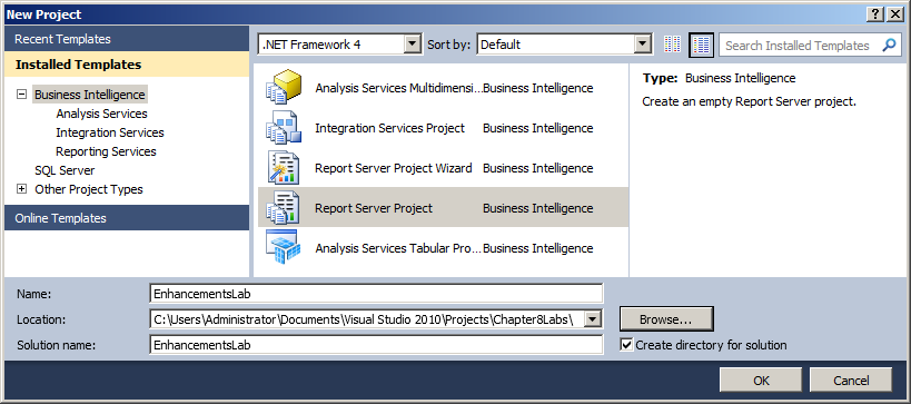
Figure 47: New Project Dialog Box
- In Solution Explorer, right-click the Shared Data Sources folder, and then click Add New Data Source.
- In the Shared Data Source Properties dialog box, type AdventureWorksDW for the Name, verify that Microsoft SQL Server is selected in the Type drop-down list, and then click Edit in the Connection string area.
- In the Connection Properties dialog box, type the appropriate server name and Authentication information, select AdventureWorksDW2012 in the Select or enter a database name drop-down list, and then click OK. The Shared Data Source Properties should be configured similar to Figure 48.
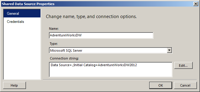
Figure 48: Shared Data Source Properties
- Use the same process to create a second data source named AdventureWorks that points to the AdventureWorks2012 database on your SQL Server. The Shared Data Source Properties should be configured similar to Figure 49.
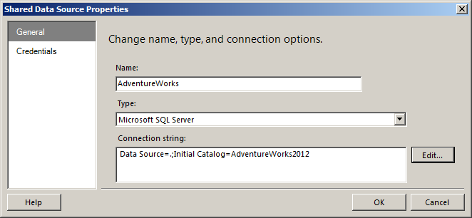
Figure 49: Shared Data Source Properties
- In Solution Explorer, right-click the Shared Datasets folder, and then click Add New Dataset.
- In the Shared Dataset Properties dialog box, type VendorInfo for the name, select AdventureWorks in the Data source drop down list, type the following query into the Query box, and then click OK:
SELECT Purchasing.ProductVendor.ProductID

, Purchasing.Vendor.Name AS VendorName, Purchasing.Vendor.AccountNumber,

Purchasing.Vendor.PreferredVendorStatus

FROM Purchasing.Vendor INNER JOIN

Purchasing.ProductVendor ON Purchasing.Vendor.BusinessEntityID = Purchasing.ProductVendor.BusinessEntityID

WHERE (Purchasing.Vendor.ActiveFlag = 1)
- Repeat the process to create a shared dataset named ProductSalesInfo based on the following query pointing to the AdventureWorksDW data source:
SELECT

DimProductCategory.EnglishProductCategoryName

AS Category

, DimProductSubcategory.EnglishProductSubcategoryName

AS Subcategory

, DimProduct.EnglishProductName AS Product

, FactInternetSales.OrderDateKey, DimDate.CalendarYear

, DimDate.MonthNumberOfYear AS Month

, FactInternetSales.SalesAmount

, FactInternetSales.ProductKey

FROM FactInternetSales INNER JOIN DimDate

ON FactInternetSales.OrderDateKey = DimDate.DateKey

INNER JOIN DimProduct

ON FactInternetSales.ProductKey = DimProduct.ProductKey

INNER JOIN DimProductSubcategory

ON DimProduct.ProductSubcategoryKey =

DimProductSubcategory.ProductSubcategoryKey

INNER JOIN DimProductCategory

ON DimProductSubcategory.ProductCategoryKey =

DimProductCategory.ProductCategoryKey
- In Solution Explorer, right-click the Reports folder, and then click Add | New Item.
- In the Add New Item dialog box, select the Report template, type ProductSalesRpt.rdl in the Name box, and then click Add. The Add New Item box should look similar to Figure 50.
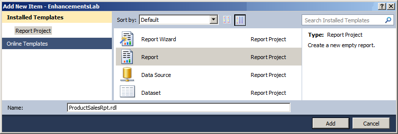
Figure 50: Add New Item
- In the Report Data window, right-click the Datasets folder, and then click Add Dataset.
- In the Dataset Properties window, type ProductSalesInfo in the Name box, select Use a shared dataset, click to select the ProductSalesInfo shared dataset, and then click OK as shown in Figure 51.
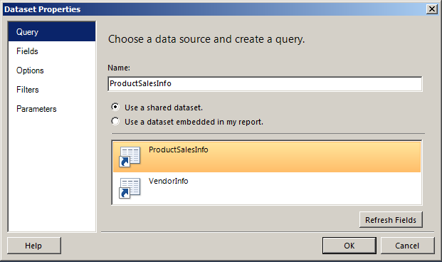
Figure 51: Dataset Properties
- Drag a Table report item from the Toolbox to the white area on the design surface representing the report body.
- Drag a Text Box report item from the Toolbox and place it above the table as shown in Figure 52.
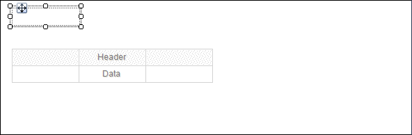
Figure 52: Text Box Positioning
- Add the title Product Sales by Year and Category to the text box. Use the Report Formatting Toolbar, shown in Figure 53 to center the title and configure the font as 24pt.

Figure 53: Formatting Toolbar
- Resize the text box appropriately. Your report should look similar to Figure 54.
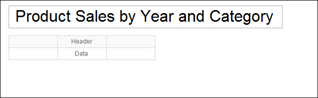
Figure 54: Formatted Report
- On the SSDT menu, click Report | Add Page Footer.
- Right-click the area near the left edge of the page footer, and then click Insert | Text Box.
- In the page footer, right-click the text box that was created, and the click Expression.
- In the Expression dialog box, type the following expression, or something similar to add the current page number, and then click OK.
="Page " & Globals!PageNumber & " of" & Globals!TotalPages
- Repeat the process from steps 22 to 24 to add the following expression to the right side of the footer to show the data and time the report was run.
="Printed: " & Globals!ExecutionTime
- Use the Report Formatting toolbar to right-justify the expression on the right side of the report footer.
- Preview the report and adjust the sizes of the text boxes you just created as needed to show all of the information.
- Drag the SalesAmount field from the Report Data window to the first column of the table as shown in Figure 55.
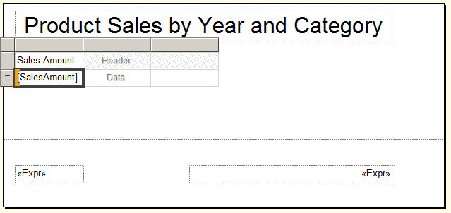
Figure 55: Adding the SalesAmount Field
- In the Row Groups area, click the down arrow next to (Details), and then click Group Properties.
- On the Visibility page of the Group Properties dialog box, click Hide, and then click OK.
- In the Row Groups area, click the down arrow next to (Details), and then click Add Group | Parent Group.
- In the Tablix group window, select [Product] in the Group by drop-down list, click the Add group header box, and then click OK.
- Use the same process to add Category as a parent group to Product, and add Year as a parent group to Category.
- In the Row Groups area, click the down arrow next to [Product], and then click Group Properties.
- On the Visibility page, click Hide, select the Display can be toggled by this report item box, select Category in the drop down list, and then click OK.
- Use a similar process to hide the Category group so that it is toggled by the CalendarYear group.
- Click in the SalesAmount text box. In the Selected Text Properties window, type C2 in the Format box in the Number section.
- Click inside the text box directly above the current [SalesAmount] text box to enter text into the box, and then type [Sum(SalesAmount)]. Highlight and copy the text, not the entire text box, and paste it into the two remaining empty text boxes in the Sales Amount column as shown in Figure 56. This will add a subtotal for each grouping.
- Add the titles Annual Total and Category Total as shown in Figure 56.
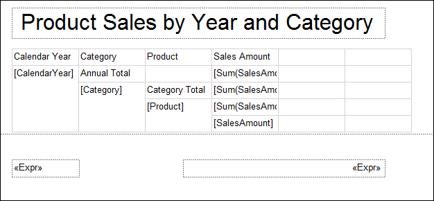
Figure 56: Sales Amount Subtotals
- Format your report to add Bold text to the title fields.
- Right-click the Tablix handle above the far right column, and click Delete Columns as shown in Figure 57.
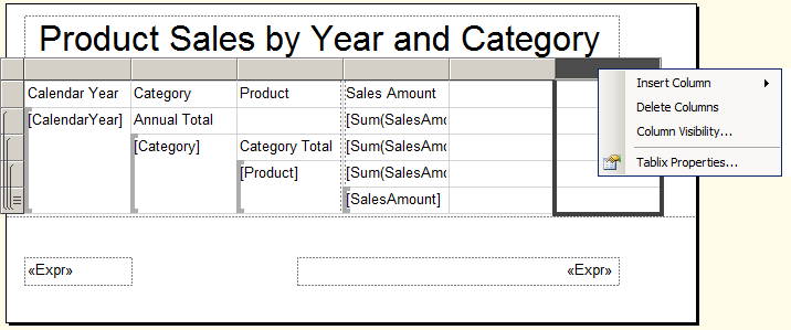
Figure 57: Deleting Columns
- Adjust the width of the remaining empty column to use the space freed by the deleted column.
- Your report design should look similar to Figure 58.

Figure 58: Completed Report
- Create a new blank report named VendorSubReport (see steps 13 and 14).
- Add a dataset pointer to this report that points to the VendorInfo shared dataset (see steps 15 and 16).
- Add a Table report item from the Toolbox to this report.
- Add the following fields to the table from left to right by dragging them from the Report Data window as shown in Figure 59:
- VendorName
- AccountNumber
- PreferredVendorStatus
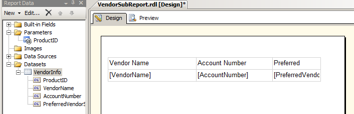
Figure 59: Adding Fields
- Use the Bold icon on the Report Formatting toolbar to format the textboxes located in the first row. You can click in the Tablix row handle to the left of the row to select and format the entire row, as shown in Figure 60.
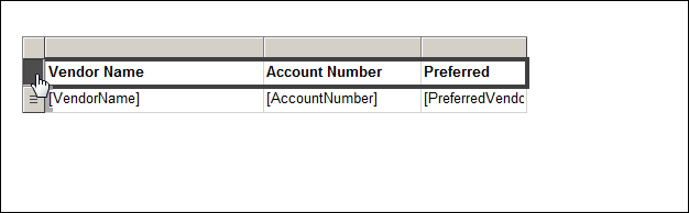
Figure 60: Selecting the Entire Row
- Select the entire first row of the table.
- In the Properties window, change the BackgroundColor property in the Fill section to silver.
- Repeat this process to add the LightSteelBlue background color to the Details rows.
- Preview the report and adjust column widths as necessary. Don’t worry about duplicate rows. These will be handled in a later exercise.
- Move the table to the upper left corner of the report body, and then adjust the report body to be the same size as your table.
- Your report Design and Preview tabs should be similar to those in Figure 61 and Figure 62.
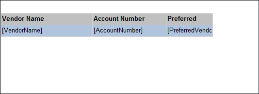
Figure 61: VendorSubReport Design
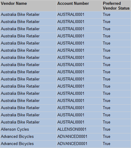
Figure 62: VendorSubReport Preview
- Leave your project and SSDT open for the next exercise.
Exercise 2 Solution: Adding data visualization report items to a report
- If your project from Exercise 1 is still open, skip to Step 4.
- Open SSDT and click File | Open | Project/Solution.
- In the Open Project dialog box, browse to the \Labs\Exercise1Solution\EnhancementsLab folder, and then click to select EnahncementsLab.sln, and then click Open.
- In Solution Explorer, under the Reports folder, double click ProductSalesRpt.rdl to open the Report Designer. Review and then Preview the report.
- Drag the Sparkline report item to the last column of the row associated with the CalendarYear group total, as shown in Figure 63.
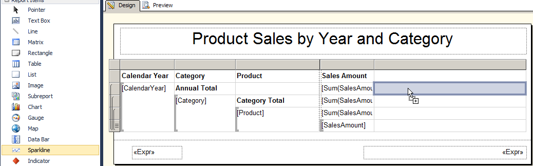
Figure 63: Adding the Sparkline
- In the Select Sparkline Type dialog box, click Line with Markers as shown in Figure 64, and then click OK.
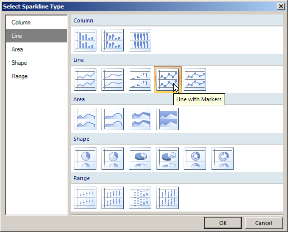
Figure 64: Line with Markers Sparkline
- Click near the middle of the new sparkline object to display the Chart Data window as shown in Figure 65.
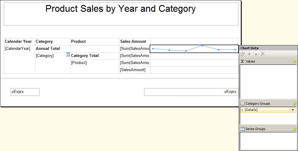
Figure 65: Chart Data Window
- In the Chart Data window, click the plus sign
 in the Category Groups section, and then click Month. Your Chart Data window should look similar to Figure 66.
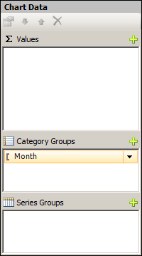
Figure 66: Category Group Month
| This field uses the numeric value for each month of the year. If you are using a month name, you would need to be sure that your data was sorted based on a calendar and not alphabetically. |
- In the Chart Data window, click the plus sign in the Values section, and then click SalesAmount. This will add the SalesAmount series and a Y Value of the Sum of the SalesAmount as shown in Figure 67.
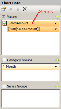
Figure 67: Values Section of the Chart Data Window
| When you add the first series, the default behavior is to sum the field selected if it is a numeric field, or provide a count of non-numeric fields. By clicking on the down arrow next to the Y Value field, you can modify the field and/or the aggregate to be used by the chart |
- Click the down arrow next to the SalesAmount series, and then click Series Properties.
- On the Series Data page, click the Expression button next to the Tooltip drop-down list.
- In the Expression dialog box, type the following code to format the Sales Amount aggregate as currency with no decimal places, and then click OK.
=FormatCurrency(Sum(Fields!SalesAmount.Value),0)
- Right click the sparkline that you added to your report, and then click Horizontal Axis Properties.
- In the Horizontal Axis Properties window, click Scalar (Numbers/Dates) for the Axis type, clear the check from Always include zero, set the Minimum value to 1 and set the Maximum value to 12. Simply type the numbers in place of the word “Auto”. The Horizontal Axis Properties should be configured as shown in Figure 68.
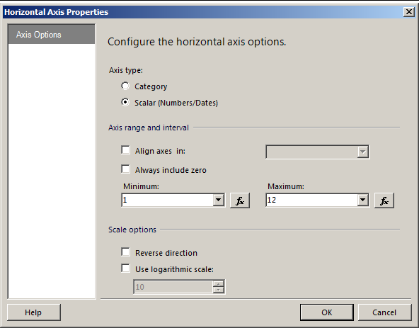
Figure 68: Horizontal Axis Properties
- Verify that the Sparkline is selected, and the Text Box, or the Chart Series objects. You can verify what object is selected by the object name in the Properties window, as shown in Figure 69.
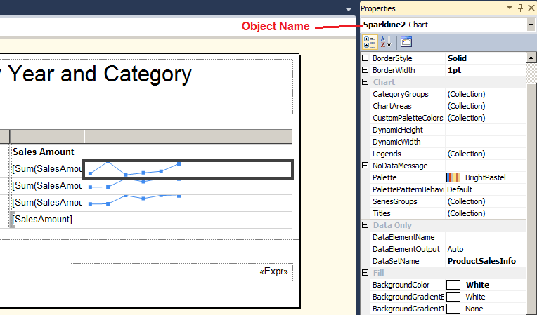
Figure 69: Sparkline Object Name
- Press CTRL-C to copy the Sparkline item to the clip board. Select the Text Box associated with the total rows for the Category group and press CTRL-V.
- Select the Text Box associated with the Product groups and press CTRL-V.
- Click the row handle to the left of the Product group row as shown in Figure 70.
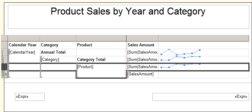
Figure 70: Product Group Row
- In the Properties window, in the Fill section, click the drop down list to the right of the Background color field, and then click More colors.
- In the Select color dialog box, click Gainsboro, and then click OK.
- Click the row handle to the left of the Category grouping, and use the Properties window to change the BackgroundColor property to LightGrey.
- Click the row handle to the left of the CalendarYear grouping, and use the Properties window to change the BackgroundColor property to Silver.
- Click in the sparkline text box associated with the Category group, and then click again directly on the line in the text box. This should bring the focus to the Chart Series.
- In the Properties window for Chart Series, expand the Marker item within the Appearance section.
- Change the BorderColor and Color properties associated with the marker to Blue.
- Additionally, just above the Marker properties, change the Color Setting to Blue. The completed settings are shown in Figure 71.
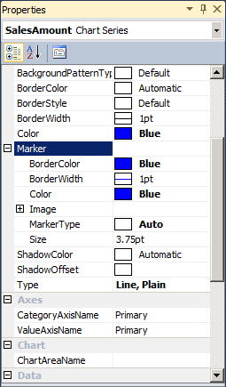
Figure 71: SalesAmount Chart Series Properties
Note: The Color property controls the color of the line connecting the markers.
- Change the markers and line colors associated with the CalendarYear group to Midnight blue.
- Preview the report. The completed report should look similar to Figure 72.
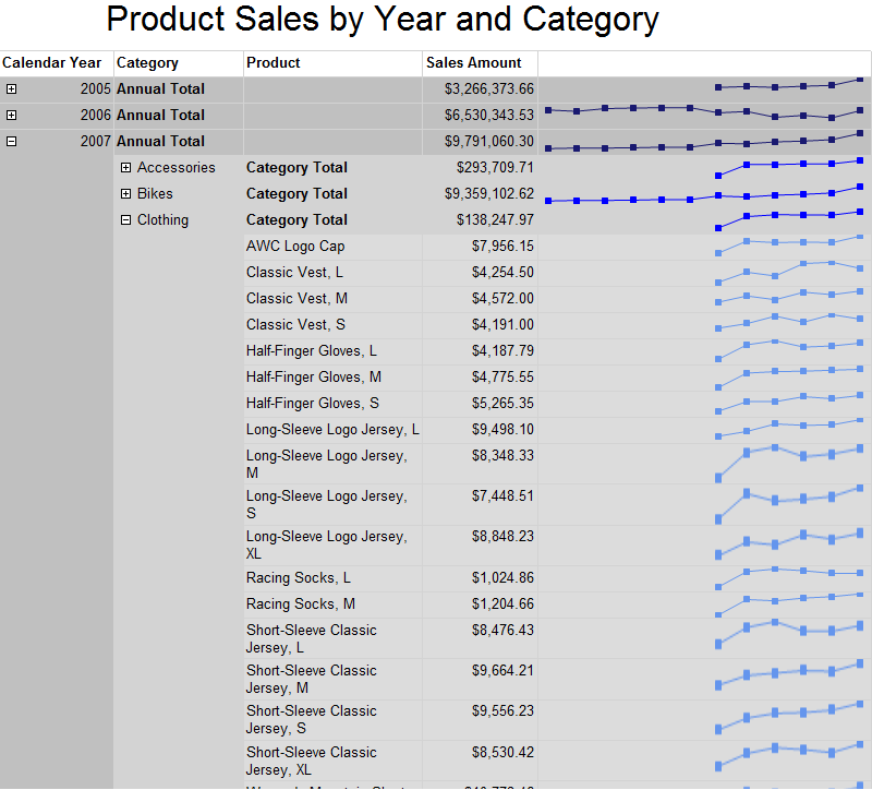
Figure 72: Completed Report
- Save all files and leave the report, project, and SSDT open for the next exercise.
Exercise 3 Solution: Adding a correlated sub-report
- In SSDT, verify that the EnhancementsLab project and solution from the previous exercise are open. If necessary open your EnhancementsLab.sln solution file from Exercise 2 or from the \Labs\Exercise2Solution \EnhancementsLab folder.
- Verify that the ProductSalesRpt.rdl and VendorSubReport.rdl reports are open in SSDT.
- If you didn’t complete the prior exercises, review and preview both reports.
- If necessary, switch to the ProductSalesRpt Design tab.
- Right-click on the [Product] group text box in the table, and then click Insert Row | Inside Group – Below as shown in Figure 73.
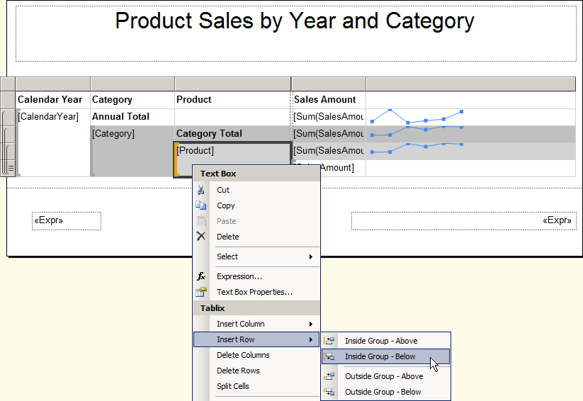
Figure 73: Inserting a Row Inside a Group
- Hold the CTRL key and click the two right-most empty cells in the new row as shown in Figure 74, right-click the selected cells, and then click Merge Cells.
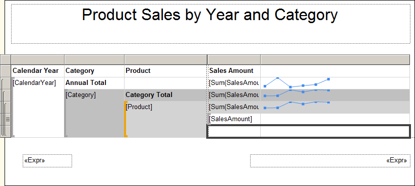
Figure 74: Merging Cells
- Drag the Subreport report item from the Toolbox to the merged cell that you just created.
- Right-click the text box with the new Subreport item, and then click Subreport Properties.
- In the Subreport Properties dialog box, select VendorSubReport.rdl in the Use this report as a subreport drop-down list.
- Change to the Report Designer for the VendorSubReport.rdl report.
- In the Report Data window of the VendorSubReport designer, right-click the parameter folder, and then click Add Parameter.
- In the Report Parameter Properties dialog box, type ProductID in the name.
- Select Integer in the Data type drop-down list, and select Hidden in the Parameter Visibility section. If you want to test the report with the parameter before testing the full solution, leave the visibility set to Visible.
Note: The ProductKey in the AdventureWorksDW2012 database maps to the ProductID in the AdventureWorks2012 database and both fields are integers.
- Right-click on the VendorInfo dataset pointer, and click Dataset Properties.
- On the Filter page, click Add.
- In the new filter definition, select [ProductID] in the Expression drop down list, and then click the expression button.
- In the Expression window, click the Parameters category, and then double click the ProductID parameter. Click OK to close the Expression dialog box.
- Click OK to close the Dataset Properties dialog box.
- Return to the ProductSalesRpt designer.
- Right-click the subreport, and click Subreport Properties.
- In the Subreport Properties dialog box, switch to the Parameters page.
- On the Parameters page, click Add.
- In the Name drop-down list, select ProductID. If the parameter is not visible in the drop-down list, type the name into field.
- In the Value drop-down list, click [Product Key], and then click OK.
- Save and preview the report.
| Sometimes modifications to the subreport cannot be seen immediately when you refresh the parent report. If this happens, save and run the subreport independently by unhiding the parameter and entering a valid part number and then go back to the parent report and try running it again. |
Author: Ann Weber, one of Accelebrate's instructors
In-Depth SQL Server Training
For in-depth SQL Server training, click here to view all of Accelebrate's SQL Server training courses for you and your staff.
Request Pricing |

