For the past few months we’ve had to reboot the cable modem every week or so. Nerd that I am, I went out and bought a new cable modem. I hooked it up like a champ, and then, BANG! It got much worse. It was slower, plus now the modem needed rebooting several times a day.
Since my wife was communicating mostly in spit and dirty looks, I called the cable company. They sent out a guy, and we (of course I hung around, “helping”) discovered that when I gave up cable TV, they put a gadget on my line that was hilariously incompatible with the new modem. The cable guy fixed everything, and I nearly fainted at how much faster it was.
I randomly sampled the bandwidth by bringing up a browser and going to a speed test page, but then I realized hey! I’m a programmer! I can automate that task. What follows is How I Did It.
The Task
My goal was to set up some scripts to run the speed test on a regular basis (every 30 minutes), log the data, and make a graph of the data available on-demand via a web browser.
The Python Toolbox
The primary tool I used is Python. It’s a powerful, but easy-to-use, language with plenty of modules available for data manipulation. In these examples, I’m using Python 2, but the Python 3 version would be very similar.
Python Modules
The following modules from the standard library:
os launch an external program
logging create a log file and add log entries
These modules from PyPI, the Python Package Index (https://pypi.python.org/pypi), which is an online repository of over 50,000 modules available for Python programmers:
pandas data analysis library
matplotlib data plotting library
web.py web development library
While these extra modules can be installed individually from PyPI (I had already installed the Anaconda bundle, which adds about 200 additional modules to the standard library.) The Anaconda modules are selected to be of use to scientists, statisticians, and engineers. See more at https://store.continuum.io/cshop/anaconda/.
speedtest-cli
speedtest-cli is a command-line tool (written in Python, although that was not why I chose it) for running Internet speed tests from the command line.
Logging The Data
To log the data, I needed to run speedtest-cli and capture its output, then write the data to a file. The output when using the –simple option consists of 3 lines:
Ping: 121.955 ms
Download: 11.77 Mbits/s
Upload: 1.07 Mbits/s
While the fancier subprocess module is suggested for running external programs, I used the simple popen() function in the os module. It opens an external program on a pipe, so you can read its standard output in the same way you’d read a text file.
To parse the data, I just used a string function to check the beginning of the line for each label, and split the line into fields, converting the middle field into a floating point number.
To write the data to a file, I used Python’s built-in logging module, because it’s simple to use and I could use a template string to automatically create custom-formatted timestamps. I added the script to crontab, which runs it twice an hour.
log_speedtest.py
#!/usr/bin/env python
import os
import logging

SPEEDTEST_CMD = '/Library/anaconda/bin/speedtest'
LOG_FILE = 'speedtest.log'

def main():
  setup_logging()
  try:
    ping, download, upload = get_speedtest_results()
  except ValueError as err:
    logging.info(err)
  else:
    logging.info("%5.1f %5.1f %5.1f", ping, download, upload)

def setup_logging():
  logging.basicConfig(
    filename=LOG_FILE,
    level=logging.INFO,
    format="%(asctime)s %(message)s",
    datefmt="%Y-%m-%d %H:%M",
)

def get_speedtest_results():
  '''
    Run test and parse results.
    Returns tuple of ping speed, download speed, and upload speed,
    or raises ValueError if unable to parse data.
  '''
ping = download = upload = None

with os.popen(SPEEDTEST_CMD + ' --simple') as speedtest_output:

  for line in speedtest_output:
    label, value, unit = line.split()
    if 'Ping' in label:
      ping = float(value)
    elif 'Download' in label:
      download = float(value)
    elif 'Upload' in label:
      upload = float(value)

if all((ping, download, upload)): # if all 3 values were parsed
  return ping, download, upload
else:
  raise ValueError('TEST FAILED')

if __name__ == '__main__':
  main()

Sample log file output:

...
2015-02-11 08:30 36.2 16.0   1.1
2015-02-11 09:00 35.4 14.2   1.1
2015-02-11 09:30 34.5 13.8   1.1
2015-02-11 10:00 31.7 16.1   0.9
2015-02-11 10:30 35.3 15.7   1.1
2015-02-11 11:00 35.4 14.2   1.1
2015-02-11 11:30 34.3 15.3   1.1
2015-02-11 12:00 92.2 16.0   1.1
2015-02-112:30 35.0 15.9   1.1
...
Parsing the Log File in Python
At this point I had a nice log file. The next step is to parse the file and plot the data.
Pandas is a really fantastic tool for parsing data. It can read data from many different sources, including flat files, CSV, SQL databases, HTML Tables and HDF5 files. It reads the data into a DataFrame, which is a 2-dimensional array something like a spreadsheet. You can select data by row and column, and there are plenty of built-in functions for indexing and analyzing the data. Reading my log file into a dataframe takes just one function call, then I can use Python “slice” notation to grab the last 48 entries, to give me 24 hours of data.
One of the things I really love about Pandas is the read_csv() function. It lets you tweak every aspect of reading in data from a file. Seriously, it has 54 possible parameters! Fortunately, you only have to specify the ones you need.
In my case, I told read_csv that to use one or more spaces, that there is no header line, to use a specified list of column names, to parse the first two columns into a single timestamp, and if a line has ‘TEST FAILED”, to set those columns to NaN (not a number).
It resembles the log file, but the data is now indexed by both row and column, so I can select all the values in the download speed column with just df[“download”].
To get the last 48 rows, I just sliced the dataframe with the expression df[-48:]. Here is the part of the plot app that reads the data; the complete script is displayed below.
def read_data():
  df = pd.io.parsers.read_csv(
    'speedtest.log',
    names='date time ping download upload'.split(),
    header=None,
    sep=r'\s+',
    parse_dates={'timestamp':[0,1]},
    na_values=['TEST','FAILED'],
  )

  return df[-48:] # return last 48 rows of data (i.e., 24 hours)
Plotting the Data in Python
The primary tool for plotting data in the Python world is the matplotlib module. It has an object-oriented API that lets you control every possible aspect of the plot. The basic object is a figure, which is a single image. The figure can contain one or more axes, which are the coordinates for plotting. Each pair of axes can plot one or more datasets. Visit http://matplotlib.org/gallery.html to see matplotlib’s capabilities.
For simple plots, there is a MATLAB-like interface that uses default objects “behind the scenes.” This interface is implemented by the matplotlib.pyplot function, which is usually aliased to just plt.
Creating a plot is as simple as creating two arrays, one for x values and one for y values, then calling matplotlib.pyplot.plot(xvalues, yvalues). The fun comes in tweaking the endless variations of color, font, shapes, position, labels, ticks, and everything else that makes up a plot.
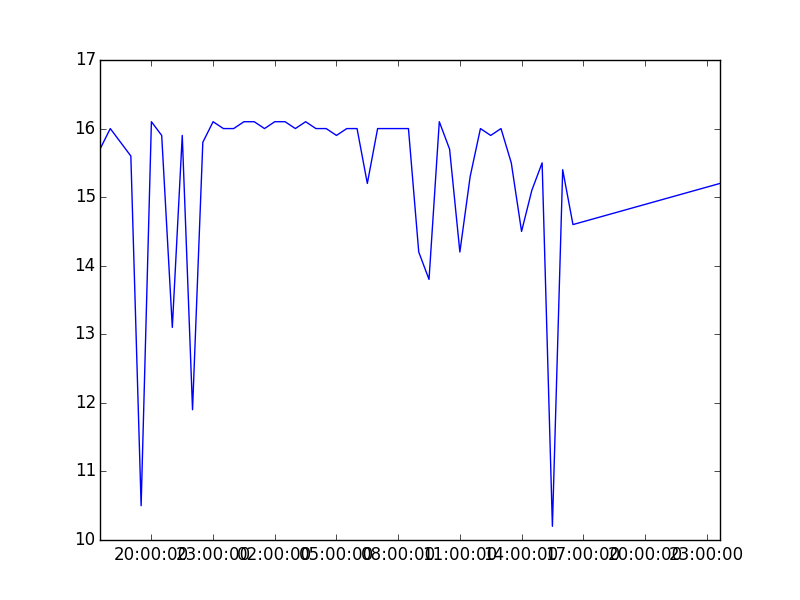
I only wanted to plot download speed against the timestamps, so I used the column headings from my Pandas dataframe to select just that data:
There are so many things wrong with this plot. It needs a title and labels for the X and Y axes. The labels on the X ticks are overlapping. Most important of all, it gives the impression that my internet speed drops to almost nothing, when really it’s only dropping a few Mbps. Overall, I changed the following:
Added a title
Added labels for the axes
Changed the Y axis scale to be 0-20Mbps.
Rotated the X axis tick labels to be at an angle
Added a background grid
There is no end to the time you can spend tweaking and tuning the appearance of the data. I had to stop myself so that I could get this post in only a little past deadline. I really wanted to add an annotation showing the slowest speed on the graph, but my programmer OCD kicked in, and I couldn’t get it to look just right. Adding basic annotations is pretty easy, but my labels were running off the figure if the lowest point was on the far left or far right.
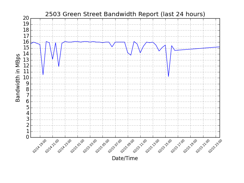
After making the above changes, here is the final result:
plot_speedtest.py
#!/usr/bin/env python
import os
import matplotlib.pyplot as plt
from matplotlib import dates, rcParams
import pandas as pd

def main():
  plot_file_name = 'bandwidth.png'
  create_plot(plot_file_name)
  os.system('open ' + plot_file_name)

def create_plot(plot_file_name):
  df = read_data()
  make_plot_file(df, plot_file_name)

def read_data():
  df = pd.io.parsers.read_csv(
    'speedtest.log',
    names='date time ping download upload'.split(),
    header=None,
    sep=r'\s+',
    parse_dates={'timestamp':[0,1]},
    na_values=['TEST','FAILED'],
  )

  print df

  return df[-48:]   # return data for last 48 periods (i.e., 24 hours)

def make_plot_file(last_24, file_plot_name):
  rcParams['xtick.labelsize'] = 'xx-small'

  plt.plot(last_24['timestamp'],last_24['download'], 'b-')
  plt.title('2503 Green Street Bandwidth Report (last 24 hours)')
  plt.ylabel('Bandwidth in MBps')
  plt.yticks(xrange(0,21))
  plt.ylim(0.0,20.0)

  plt.xlabel('Date/Time')
  plt.xticks(rotation='45')

  plt.grid()

  current_axes = plt.gca()
  current_figure = plt.gcf()

  hfmt = dates.DateFormatter('%m/%d %H:%M')
  current_axes.xaxis.set_major_formatter(hfmt)
  current_figure.subplots_adjust(bottom=.25)

  loc = current_axes.xaxis.get_major_locator()
  loc.maxticks[dates.HOURLY] = 24
  loc.maxticks[dates.MINUTELY] = 60

  current_figure.savefig(file_plot_name)

if __name__ == '__main__':
  main()
Serving Up The Data
The graph looks good, so what’s left is to serve the graph image up on a web server so that I can access it any time. There are many web application frameworks for Python. One of the simplest, yet most powerful is web.py (http://webpy.org/). You can render HTML pages or data very easily, and it has a built-in HTTP server.
Adam Atlas says “Django lets you write web apps in Django. TurboGears lets you write web apps in TurboGears. Web.py lets you write web apps in Python.” (http://webpy.org/sites)
There are three basic components:
URL mapping
Request handler classes (AKA “controllers”)
Templates (AKA “views”)
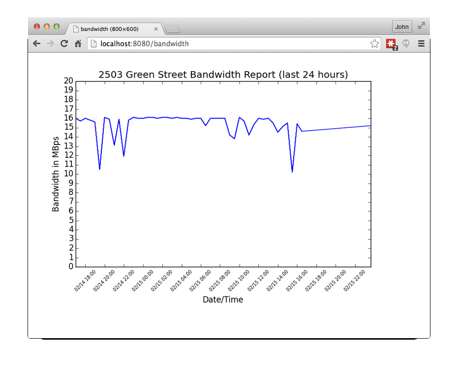
I chose to just serve the saved graph image directly, so no template is needed for this application.
URL mapping consists of a tuple (or any array-like object) containing (pattern, class, …). Repeat the pattern-class pair for each URL in your application. I have only one, but you can have as many as you need. The pattern is a regular expression that matches the actual URL. Any part of the URL that needs to be passed to the handler is marked as a group. This allows you to do things like:
To show the graph, I just hard-coded the URL ‘/bandwidth’. If I was more ambitious I could have added a fancier URL that lets you pick the starting date and time, such as ‘/bandwidth/02https://cdn.accelebrate.com/images/blog/pandas-bandwidth-python-tutorial-plotting-results-internet-speed-tests/1000′:
The request handler is a class that contains a GET method. If the URL contains any groups, they are passed to the GET method as parameters. The GET method returns the content. It defaults to returning HTML, but you can return any kind of data, by adding an HTTP header. In this case, I’m return a PNG file, so I generated the appropriate header. To return the image, I just read the image into memory and returned it as a string of bytes.
The rest of the app is boilerplate for starting up the built-in web server. For production, web.py apps can be integrated with apache, nginx, gunicorn, or other web servers.
serve_to_web.py
#!/usr/bin/env python
import web
import plot_speedtest

PLOT_NAME = 'bandwidth.png'

urls = (
'/bandwidth', 'showplot',
)

class showplot:
def GET(self):
plot_speedtest.create_plot(PLOT_NAME)
web.header("Content-Type", 'image/png')   # set HTTP header
return open(PLOT_NAME,"rb").read() # open image for reading

app = web.application(urls, globals())

if __name__ == "__main__":
app.run()
Conclusion
Python is my go-to language for quickly analyzing and displaying data. It takes very little code to create a professional app, and the code remains readable (and thus maintainable) as the app scales to handle more data and more features.
Author: John Strickler, one of Accelebrate’s Python instructors
John is a long-time trainer of Accelebrate and has taught all over the US. He is a programmer, trainer, and consultant for Python, SQL, Django, and Flask.